


Consistent typography is the foundation for a successful identity system. The characteristics of a certain typeface often communicate as much about an organization as the words used to describe it. When used consistently, the typeface becomes synonymous with the organization.
Since typography is largely responsible for the general character or appearance of printed material, its coordinated and consistent use is essential to establish and maintain a graphic “look” for all of the university’s internal and external visual communications. A successful typographic style will provide the qualities of consistency, clarity and readability.
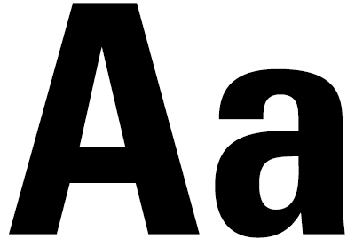
Univers Condensed
Typography selection for the marriage of the STATE logo to the word mark was a primary concern in this. The STATE logo has been an established university mark since the mid-1980s.
Selecting an appropriately strong font family to balance with the bold STATE logo was a crucial decision. Univers Condensed, a sans-serif font, was carefully selected for its qualities of distinction, modernism, clean simplicity and legibility.
Univers’ even stroke weights create a harmonious relationship with the STATE logo. Its varied weights make it an appropriate solution for functioning as larger text, such as mastheads or headlines, or for smaller text and labels, such as call-outs, cut lines and credits.

Adobe Garamond
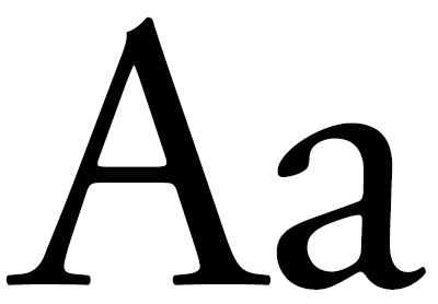
Adobe Garamond is an easily readable typeface, ideally suited for copy-intense documents. Adobe Garamond’s letterforms convey a sense of fluidity and consistency. This typeface is considered to be among the most legible and readable serif typefaces for use in print applications.
An excellent solution for the body of newsletters, brochures, or other business applications, Adobe Garamond is the preferred font for all correspondence and publications of Arkansas State University.
In all applications, proper attention paid to line length and leading ensure legibility. In most materials, type should be set flush left. Like all serif faces, be wary of setting Adobe Garamond too small or reversing it out of dense color fields.
